The question arrives at the artwork stage, when the box structure is already settled: the quotation lists “hot foil stamping,” “spot UV” and “embossing” as three checkboxes, and the designer says “let’s add some gold.” The three options are not intensities of the same thing — they are three different machines, three sets of tooling, and three different rules about what your design is allowed to contain. This is the specification we walk buyers through, with the artwork limits our own in-house finishing lines hold every day.
1. What the three finishes actually do
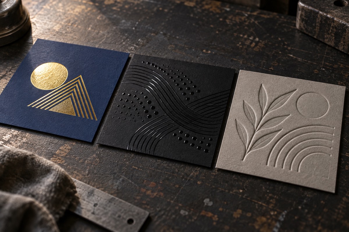
Foil stamping uses heat and pressure to transfer metallic foil from a die-cut carrier onto the board — no ink is involved, which is why the result reflects light like metal. Spot UV is a varnish printed through a mask onto selected areas only, cured to a high gloss (or a textured matte) over the laminated surface. Embossing and debossing press the board itself between a male and a female steel die — the paper is squeezed into a raised or sunken relief, with nothing added and nothing printed.
| Foil stamping | Spot UV | Emboss / deboss | |
|---|---|---|---|
| What the eye sees | Metallic light — gold, silver, rose gold, holographic or solid pigment | Glossy highlights against a matte field | Shadow at the edge of a raised or pressed-in shape |
| What the hand feels | Almost nothing — a thin metallic layer | A raised varnish film on the coated areas | Real relief — the strongest tactile effect of the three |
| Best at | Logos, monograms, borders — marks that should read as premium at a glance | Patterns, textures, fine line work as a contrast layer | Large logos and quiet, confident branding — the lid of a gift box |
| Artwork floor | ~0.5 mm minimum line; hairlines break at the die edge | ~6 pt minimum type; fine text fills in at the mask edge | Needs graphic mass — thin strokes cannot hold the relief |
| Classic failure | Broken serif hairlines, foil bridging across thin gaps | Fine type vanishing into a glossy blob | Relief telegraphing through thin board, or crushing corrugated flute |
| Tooling it needs | A foil die cut to the design | A mask for exactly the varnished areas | A male-and-female die pair — the deepest tooling of the three |
Read that table as a division of labour rather than a ranking. Foil buys attention, UV buys texture, emboss buys touch — a box that wants all three sensations is a box that can carry all three passes, which most small panels cannot.
2. Your artwork decides before your budget does
This is the part that surprises buyers who chose a finish from a mood board: the logo file, not the price list, often eliminates an option outright. Three gates decide it, and all three are physical.
Foil has a line-width floor. The die is cut to your design, and anything thinner than about half a millimetre breaks at the die edge or bridges across narrow gaps. Hairline serifs, 0.25 pt rules and tightly tracked light type are the usual casualties — the foil tears instead of releasing cleanly. Medium-weight sans, bold serifs, solid shapes and generous letter-spacing are the foil-safe zone. The file must be vector with text outlined; a small raster JPEG cannot be cut into a die at all.
Spot UV has a type-size floor. The mask is cut to the areas that catch the varnish, and anything finer than about 6 pt fills in at the mask edge — a tagline in 5 pt UV comes back as a glossy smear. UV earns its keep as a pattern instead: dot screens, line textures, a repeated motif, or a contrast band against the matte lamination underneath. It needs a matte partner to shine against — glossy UV on a glossy laminate is invisible.
Embossing needs graphic mass. The die presses the board into relief, and the shape must be big and solid enough to hold it. A thin-lined logo crushes; a wordmark with area, a monogram, a geometric mark, takes the relief beautifully. The board matters as much as the art: thin boards telegraph the relief to the reverse side, and on corrugated the emboss fights the flute — the same flute rhythm that shows through dark fills on a B-flute mailer will distort a pressed relief. Rigid greyboard takes an emboss best, which is why the technique lives on lids like our magnetic closure boxes. The board choice behind that is compared in our rigid box vs folding carton guide.
3. How each finish moves the price
The money logic follows the tooling, and it is the same arithmetic as the rest of the quotation — each finish is its own production pass with its own fixed setup, laid out lever by lever in what drives the cost of a custom box. What each pass adds on top:
- Foil stamping — the die is cut to your design and costs the same at any volume, but the foil itself is consumed by area: a large foiled panel eats more foil per sheet than a small logo, so the running cost follows the covered square millimetres. Position count matters too — one foiled logo per box is a different job from six.
- Spot UV — the mask is cut to your pattern, then varnish is laid per sheet. It is usually the least expensive of the three, which is why it is the safe way to add a finish without moving the quotation much. Very large varnished areas narrow the gap.
- Embossing — the deepest tooling of the three, a matched male-and-female die pair, so the fixed setup is the highest; after that there is no consumable, just press time. On long runs the per-piece premium is often the smallest of the three.
Two levers decide which finish is “expensive” on your job, not the finish’s name: quantity (tooling amortised over a small run is the dominant cost; over a large run it nearly vanishes) and area (foil and UV are consumed, embossing is not). One practical consequence: “add foil later” is often cheaper than designing it in from the first thousand pieces — unless the design needs a registered combination, which must be planned from the start.
4. When no finish is the right answer
The most common correction in production is subtraction, not addition. Four anti-patterns worth knowing:
- All three on one small panel. Foil, UV and emboss stacked into a 40 mm logo zone does not read as luxury — it reads as noise, and each pass adds a registration tolerance the next one has to hit. One finish, placed well, is what a premium box actually looks like.
- Foil against the brand’s own story. A kraft, organic or recycled-positioning box fights gold foil — plain ink on honest kraft is the look that brand already chose. Adding a finish to signal quality is spending money against your own positioning.
- Embossing on the wrong board. On folding cartons and corrugated the relief telegraphs through or crushes the flute; the finish belongs on rigid construction, not on a thin mailer wall.
- Small runs where tooling dominates. Below the quantity where setup amortises, every added finish roughly re-buys its tooling. Pick the one finish that carries the brand and skip the rest.
One honest footnote on sustainability claims: the foil layer is microns thick and small foiled areas are widely handled in standard paper recycling streams — but if your market or certification scheme requires a specific recycled-content or compostable claim, send us the exact construction and we will print the specification your scheme needs to answer. We would rather you verify the claim than inherit ours.
5. Shortcuts by product, from our own line
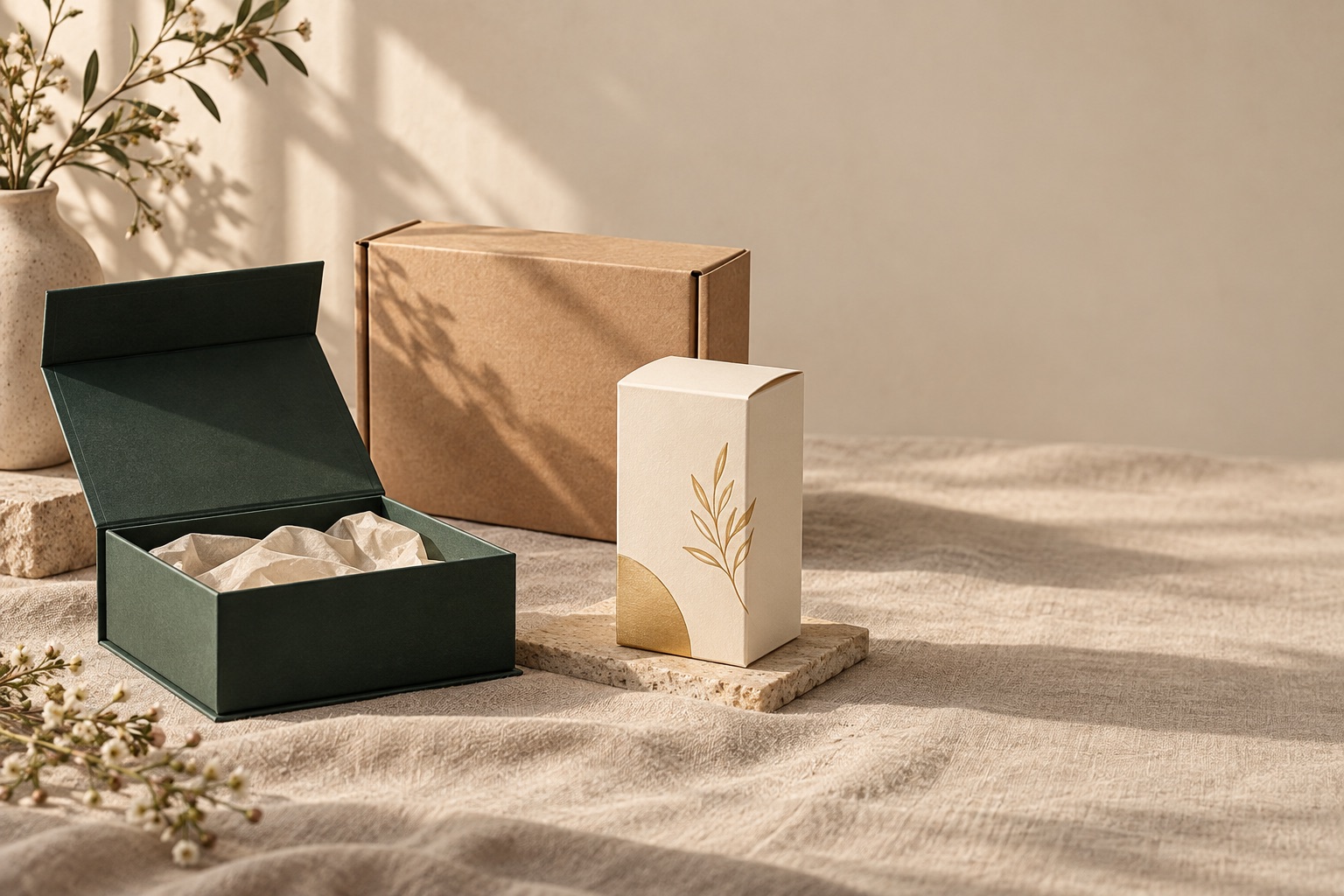
- Cosmetics gift sets & magnetic rigid boxes → gold foil logo plus a registered deboss on the lid. The classic pairing: foil catches the light on the mark, the deboss gives the lid its quiet depth. This is the finish set our magnetic line runs most.
- Tech and subscription DTC → soft-touch matte with a spot-UV pattern. The modern pairing — the matte field feels considered, the UV pattern gives the fingers something to find.
- Jewelry and small luxury → blind deboss, no foil. The quietest of the three reads as the most confident: relief without metallic, no colour to date the design.
- Skincare and perfume folding cartons → one foil accent plus spot UV on a single panel. Enough finish to signal premium at the shelf, restrained enough to keep the print doing the selling.
- Organic, kraft and eco-positioned boxes → no finish. Plain ink on kraft. The material is the statement.
If your logo sits between these cases — a hairline wordmark that wants foil, a pattern that wants UV — that is exactly the case to send over. We mark the foil-safe and UV-safe areas on your artwork and come back with each finish priced on its own line, so the choice is visible instead of buried in a lump sum.
FAQ
Can foil and embossing be combined?
Yes, and it is a standard rigid-box technique: the board is embossed first and foil is laid onto the raised areas, or foil is stamped and then pressed through it. Both sequences need artwork designed for the combination from the start — the die pair and the foil die are cut together, and the registration between them is the whole job. Retrofitting a registered combo onto an existing design usually means new tooling.
What foil colours exist?
Metallics in gold, silver and rose gold, holographic and laser foils that shift with the viewing angle, and pigmented foils in solid colours when the brand calls for a non-metallic accent. On uncoated kraft the foil sits differently — less crisp edges, more of the fibre showing through — which some brands prefer and others do not; we can sample both before you commit.
Do foiled boxes still recycle?
The metal layer is microns thick, and small foiled areas are widely accepted in standard paper recycling streams. What we will not do is certify your claim for you: if your packaging needs to carry a specific recycled-content, compostable or recyclability statement, send the construction details to your scheme and we will supply the exact specification they ask for. The honest answer is verified per market, not assumed.
Emboss or deboss — what is the difference?
An emboss raises the design above the surface; a deboss presses it in. Deboss reads quieter and more premium on lids and is what most gift-box brands choose; emboss pops more on lighter stocks. Registered designs often use both — a raised border with a pressed-in monogram — which is one die pair doing coordinated work.
Not Sure Which Finish Your Logo Needs?
Send your artwork and box size: the quotation comes back within 24 hours with foil, spot UV and embossing each priced on its own line — plus a free dieline and the finish-safe areas marked on your design.
Get the finish spec →Notes on figures
Line-width and type-size floors (~0.5 mm for foil dies, ~6 pt for spot-UV masks) are practical rule-of-thumb limits, not industry standards — final judgement is made per design on the dieline before sampling. Prices are deliberately absent: board, foil and freight prices move with the market, which is why every quotation is itemised and dated instead of published. Recycling guidance is deliberately conservative; claims for your market should be verified with your certification scheme.